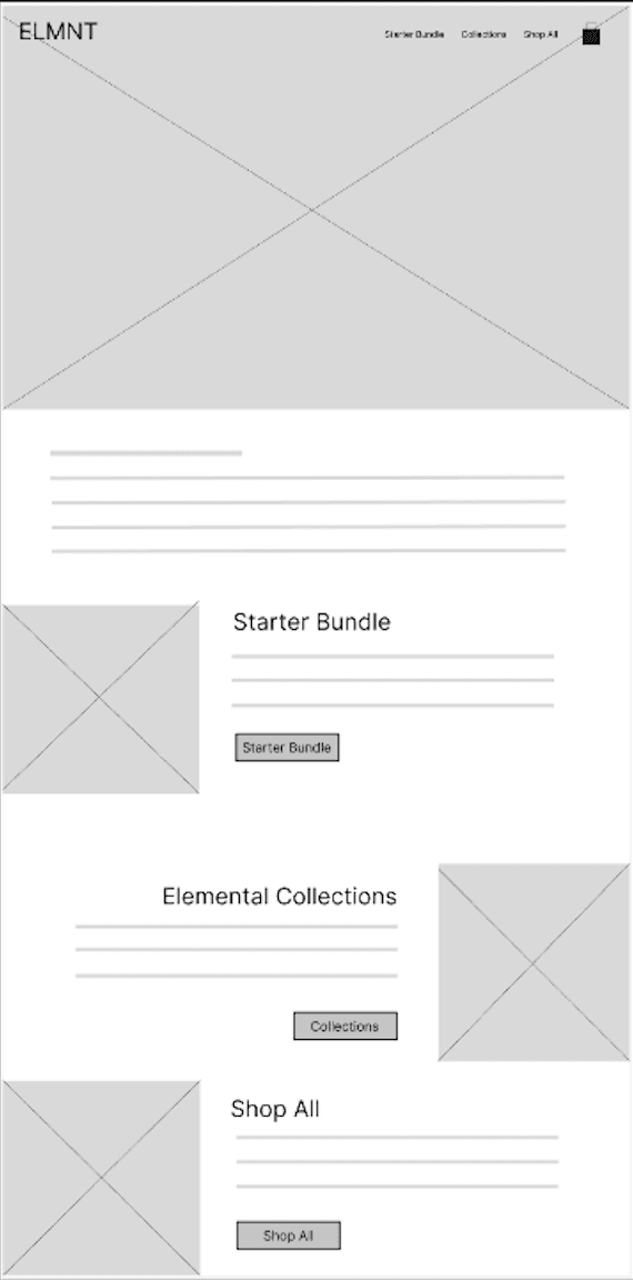
HOMEPAGE
Added grid to Collections
Added grid to Collections for quicker scanning and variety at a glance.
RESPONSIVE WEBSITE DESIGN
PROJECT
Design a responsive website for a camping e-commerce experience.
ROLE
UX/UI Designer, Researcher, Visual Designer, Usability Tester
DURATION
May 2025 – July 2025
UX/UI SKILLSETS LEVERAGED
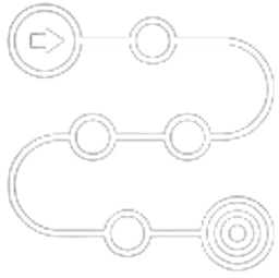
USER FLOW
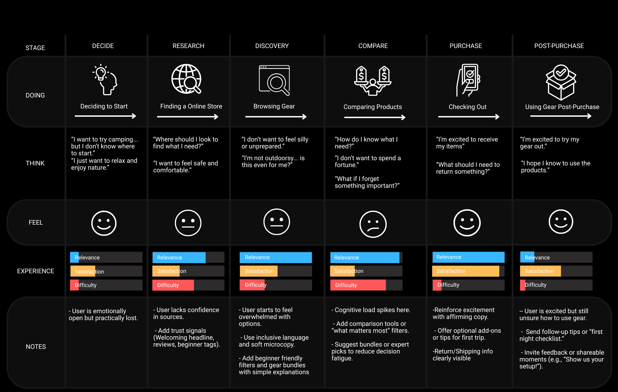
To better understand the user decision-making process while on a store website, I created a user journey map. This helped identify moments of confusion and stress across the shopping experience, as well as opportunities to simplify decision-making with clear guidance.
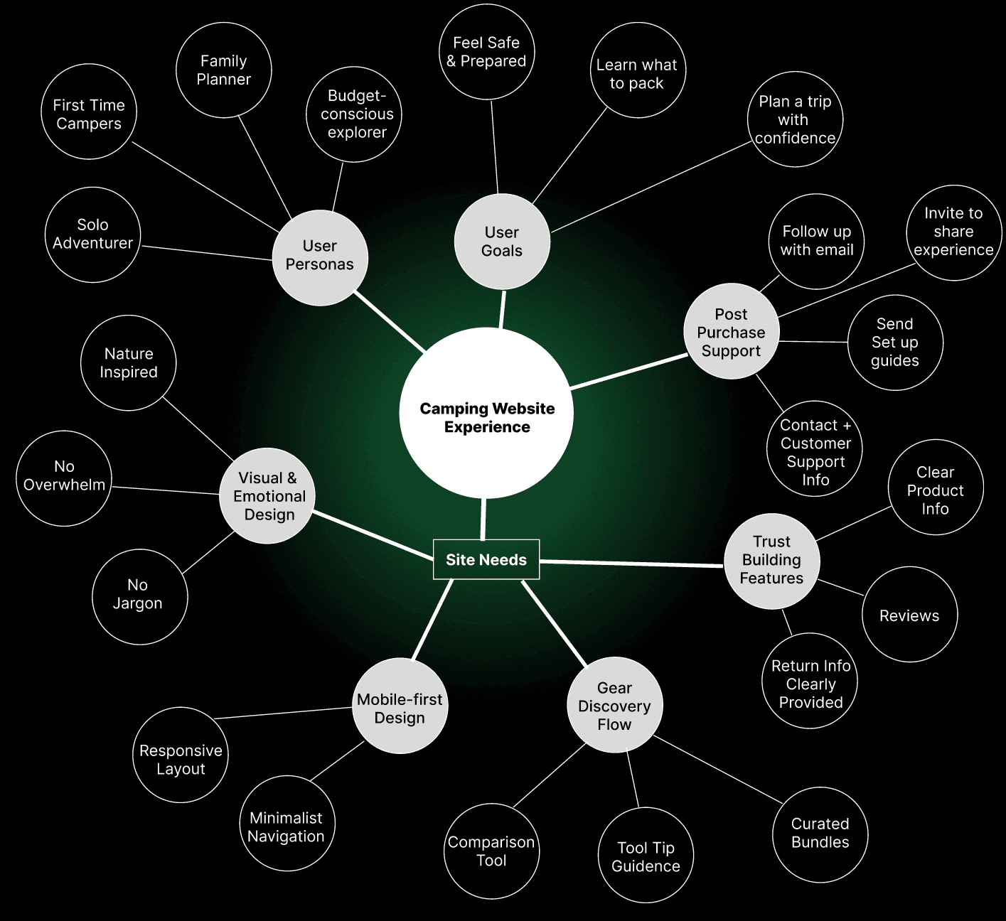
MIND MAP
After mapping the user journey, I created a mind map to explore how different user goals, pain points, and personas could translate into the website’s needs and features. This helped visualize the relationships between problems and possible solutions, ensuring design priorities aligned with user and business goals.
KEY INSIGHTS
User journeys and mind mapping helped identify where first-time campers felt uncertain or overwhelmed. These methods revealed core pain points and guided the design goals shown below, ensuring design decisions are supporting the user experience.
Users lacked clear entry points and guidance while shopping, which created uncertainty at the beginning of their journey.
DESIGN GOAL
Simplify interface so it’s informative yet beginner-friendly and easy to navigate.

Large catalogs overwhelmed users, making comparison and product discovery difficult.
DESIGN GOAL
Ease into gear discovery with curated product lines and collections.

Technical jargon and unclear features reduced trust and confidence.
DESIGN GOAL
Build trust through clear, digestible product descriptions, setup guides, and reviews.
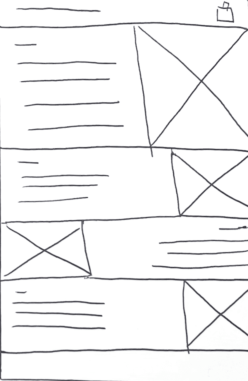
LOW-FI EXPLORATION
I began with low-fidelity wireframes to explore layouts that reduce overwhelm and guide users quickly toward the right gear. Since research showed beginners feel unsure where to start, I focused on surfacing curated bundles and trust-building elements early in the flow. Each frame experimented with ways to balance product discovery and clarity without clutter.
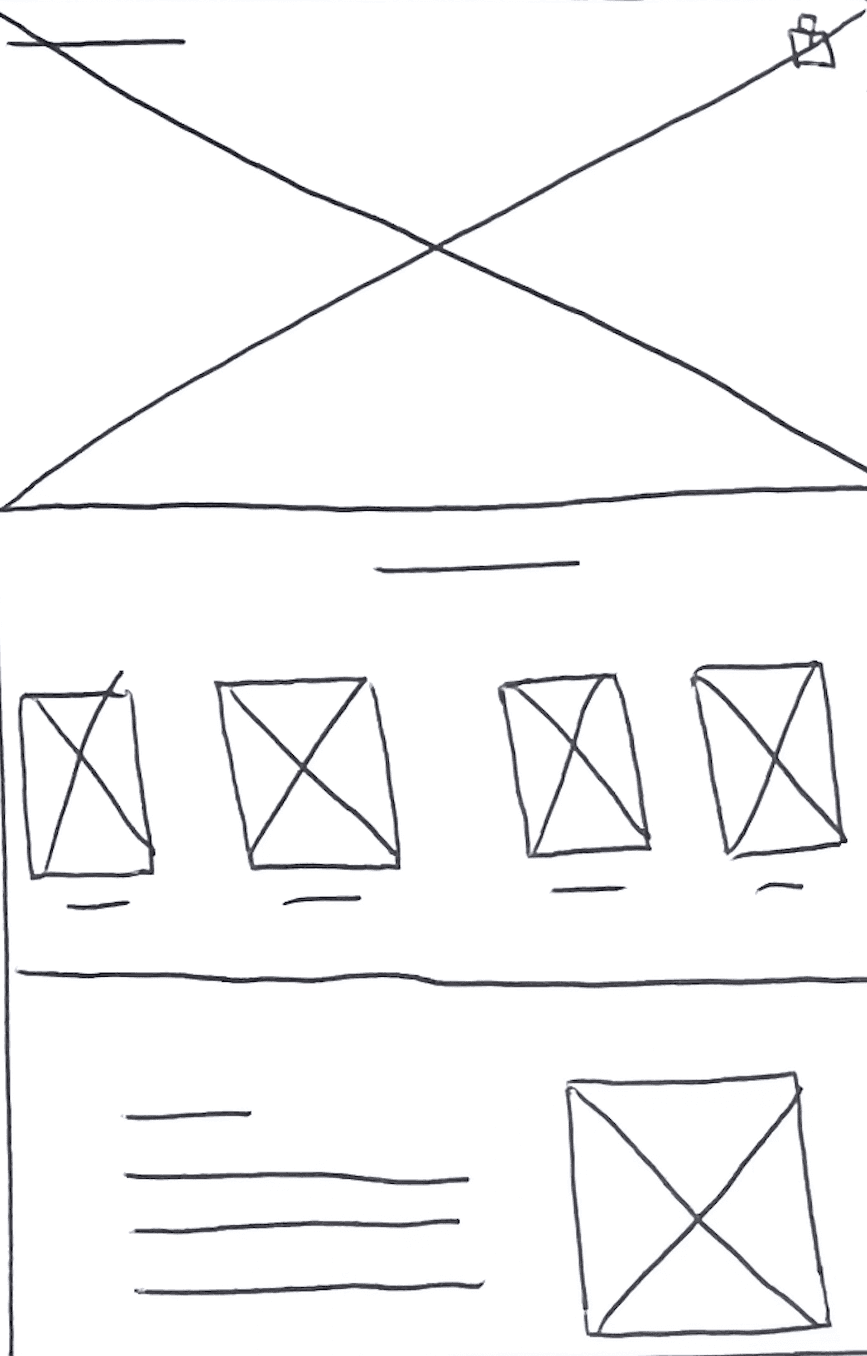
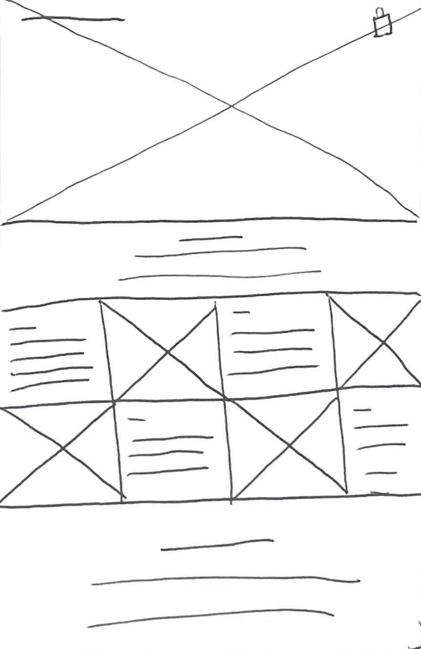
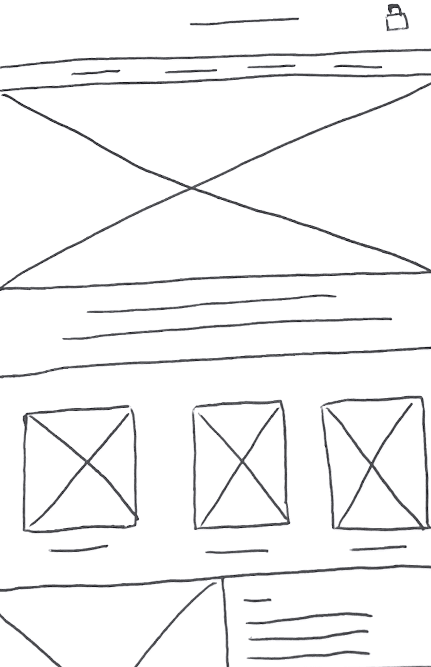
HOMEPAGE WIREFRAMES
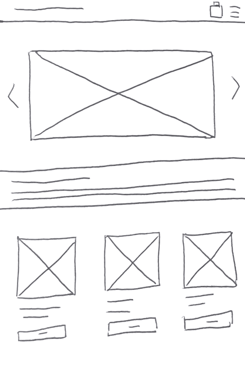
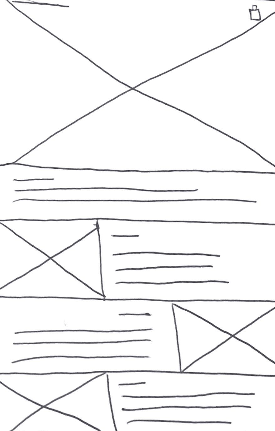
LOW FIDELITY PROTOTYPES
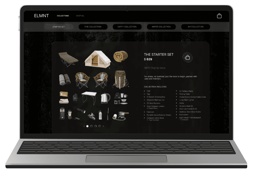
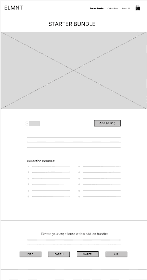
After my user research, my goal was to simplify the layout, curating gear selections, and clearly communicating value. Every design choice, from the streamlined bundle presentation to the guided add-on options, was made to reduce decision fatigue and build confidence for users shopping.

LOW FIDELITY PROTOTYPES
HOMEPAGE PROTOTYPE
PRODUCT PAGE PROTOTYPE
TESTING & ITERATION
WHAT I WANTED TO LEARN
Do users quickly grasp what the site offers?
Can users move from discovery to purchase without friction?
Do tighter bundles + clear copy raise purchase confidence?
HOW I TESTED IT
I ran a moderated usability test with one participant. During the session, I:
Even with a single participant, the test revealed how a first-time visitor interprets the homepage and moves through the flow.
HOW I IMPROVED THE DESIGN
These changes balanced simplicity and trust. Clear explanations + streamlined selection increased confidence to complete a purchase.
WHAT I DISCOVERED
CLARITY
NAVIGATION
CONFIDENCE
FINDINGS → REFINEMENTS
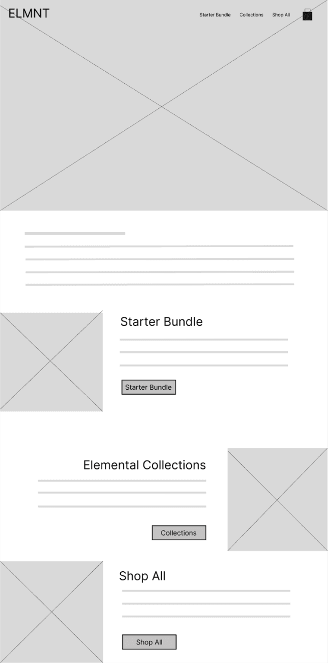
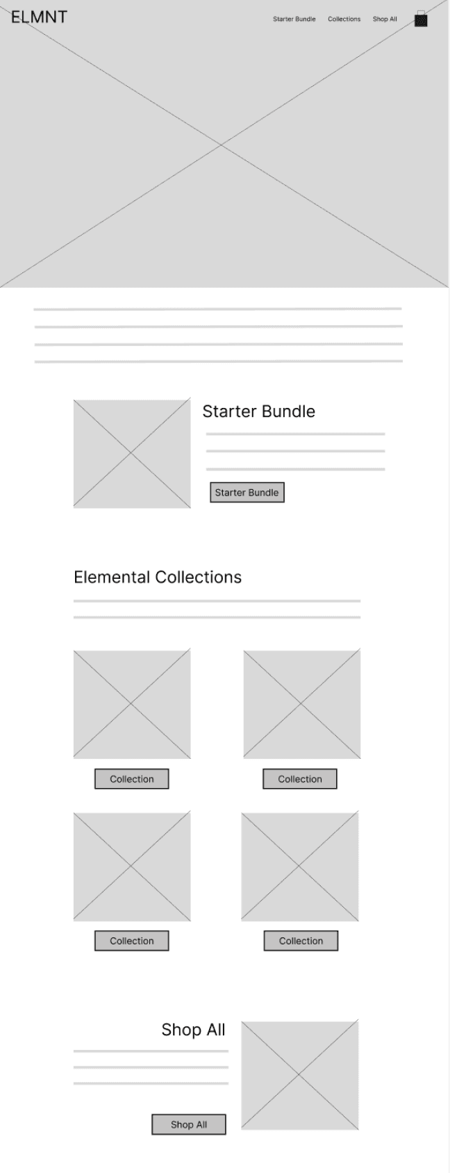
HOMEPAGE
Added grid to Collections for quicker scanning and variety at a glance.
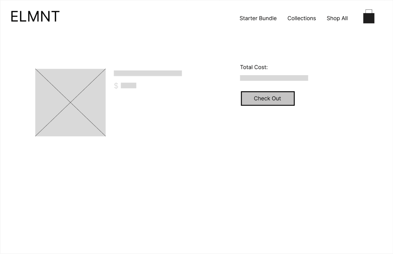
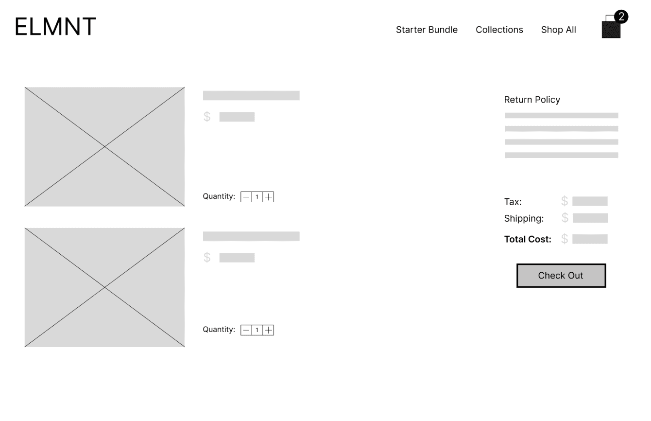
CHECKOUT SCREEN
Added quantity adjuster, return policy, and tax/shipping info to reduce hesitation and reinforce trust.
Before Usability Study
After Usability Study
PROJECT OUTCOME
The final product is an intuitive and sleek e-commerce experience designed to help users feel confident while gearing up for the outdoors. Clear navigation, curated bundles, and simplified product details reduce decision fatigue and make selections feel guided rather than overwhelming. Thoughtful information hierarchy and reassuring microcopy support users at every step, while a clean, modern visual style reinforces trust and brand clarity. The result is a shopping experience that transforms uncertainty into excitement, empowering users to explore nature with confidence and the right gear for their adventure.
OUTCOME & RESULTS
Improved clarity: Clearer structure between Starter Bundles, Elemental Collections, and Shop All.
Smoother navigation: Fewer steps and more visible calls-to-action reduce backtracking.
Increased confidence: Curated bundles and clearer details lower decision fatigue.
Cross-platform consistency: Mobile and desktop provide the same structured guidance.
Opportunities remain to continue improving confidence and clarity:
Validate with more users
Ensure improvements hold true across diverse beginners.
Refine product copy
Test wording that most effectively reassures new campers.
Measure engagement
Track which entry points drive confident purchases.