MOBILE APPLICATION
How Emotionally Intelligent Design Improves Booking Confidence for Dog Grooming
PROJECT
Design a mobile-first app for a local dog grooming service.
ROLE
UX/UI Designer, Researcher, Visual Designer, Usability Tester
DURATION
July 2025 – August 2025
UX/UI SKILLSETS LEVERAGED
MARKET RESEARCH
Exploring the Grooming Space
of U.S. households
own at least one dog
of pet owners prefer
scheduling appointments online
of pet owners find it
challenging to schedule grooming services
Market Insights
I conducted secondary research by analyzing app reviews, service provider websites, and pet-care forums to learn how dog grooming digital experiences feel to users today. Through my research I found:
- • There’s a gap in user-friendly grooming apps overall.
- • Many groomers rely on outdated websites and phone calls.
- • First-time users seek reassurance their dog will be treated with care.
- • Users worry about timing, delays, and unexpected changes.
Key takeaway: Trust, transparency, and clear communication matter as much as convenience.
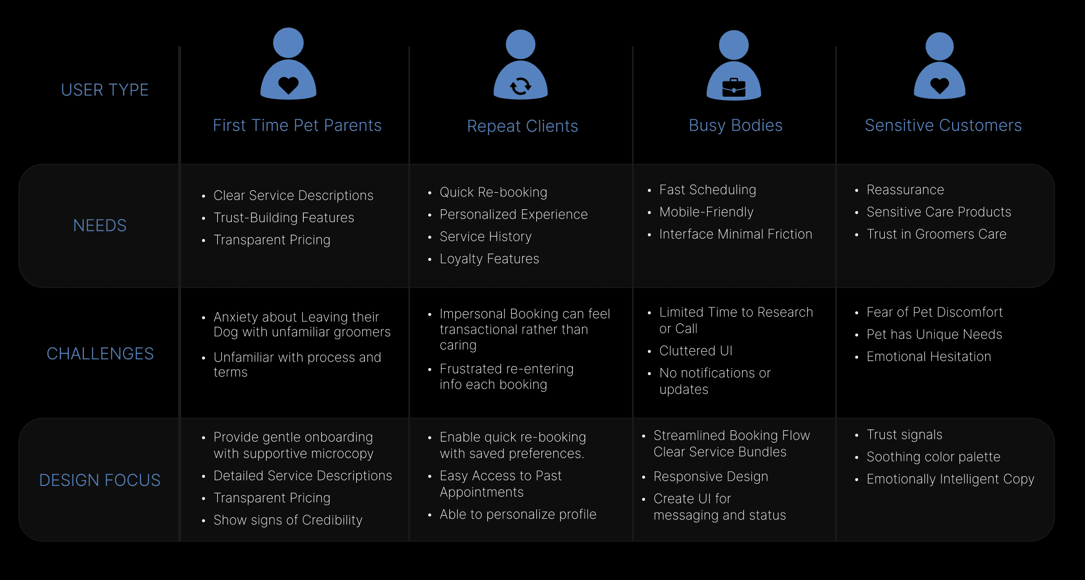
USER PERSONAS
Who's Behind the Experience
After research, my next step was to understand the user. Based on market insights, I developed four user personas to align design choices with the diverse needs and challenges of pet owners.
DEFINING THE DESIGN
6 UX Findings and Design Goals
From my research, I identified key focus areas from user needs to guide my UI design decisions. These findings highlight the need for a digital experience that builds trust, simplifies decisions, and streamlines the booking process.


TRUST IS TOP PRIORITY
Goal: Show groomer bios, reviews, certifications, and past work.


BOOKING FLOWS ARE CLUNKY OR OVERWHELMING
Goal: Allow quick appointment scheduling with a clean UI.


REAL-TIME UPDATES & COMMUNICATION IS RARE
Goal: Provide messaging and status notifications.


REPEAT USERS WANT PERSONALIZATION
Goal: Let users create dog profiles to save preferences and see past appointments.


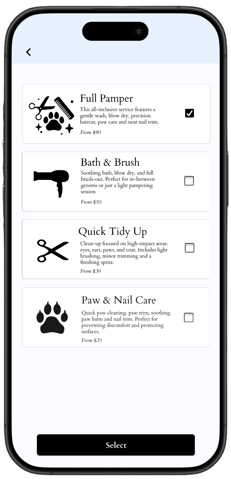
SERVICE DESCRIPTIONS ARE OFTEN VAGUE
Goal: Use clear, detailed descriptions to reduce confusion and support calls.


VISUAL DESIGN OFTEN FEELS OUTDATED OR GENERIC
Goal: Use warm colors, friendly microcopy, and pet-centric imagery.
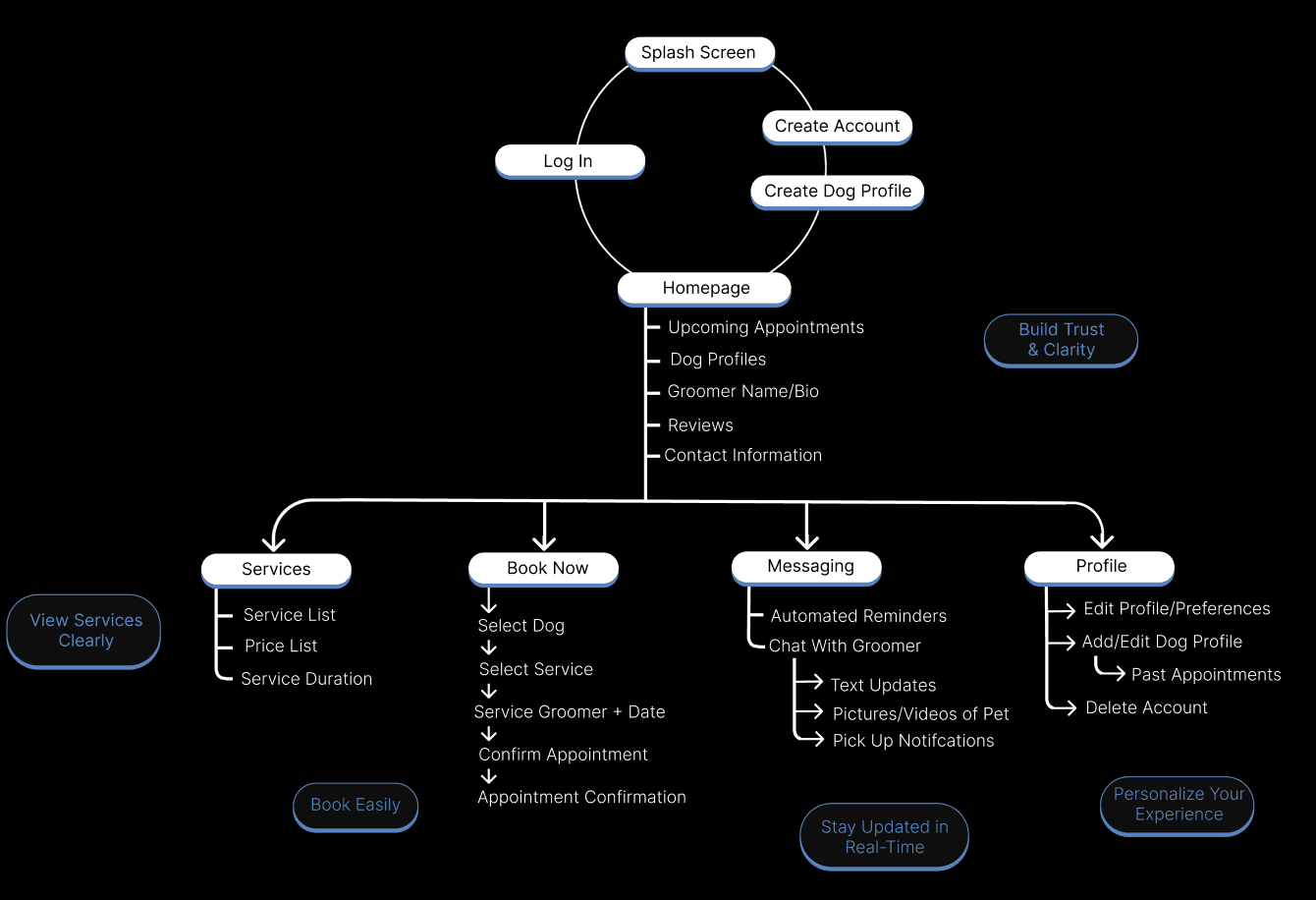
INFORMATION ARCHITECTURE
Turning Goals Into App Flows
My focus was to make information easily accessible with clear navigation for effortless booking and browsing. The site map helps ensure that the structure of the app consistently addresses user needs uncovered in my research.
LOW-FI EXPLORATION
Key Wireframes
I began sketching early concepts of the pages. These quick sketches allowed me to explore layouts and content hierarchy. I tested different navigation bar options to see which would enhance usability and identified which items were most essential to feature. Wireframing helped me establish early structure for core flows; appointment creation, groomer discovery, and status visibility.
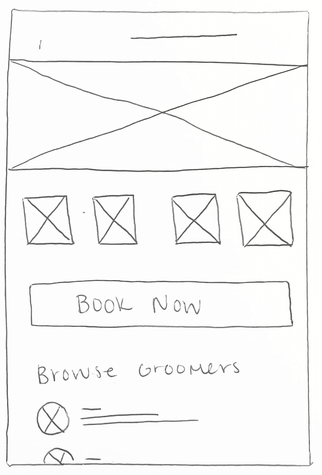
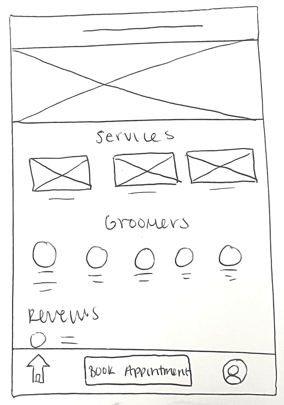
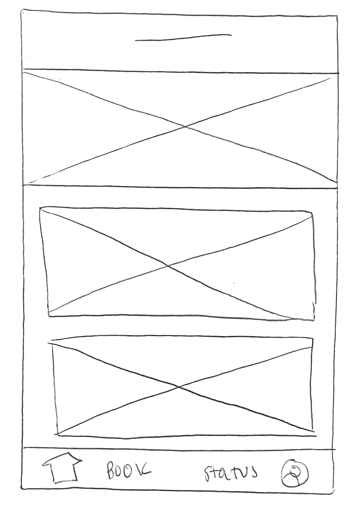
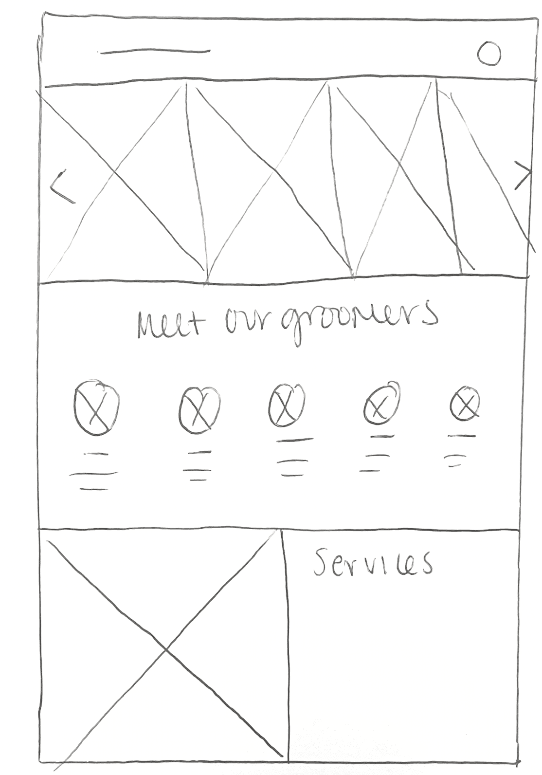
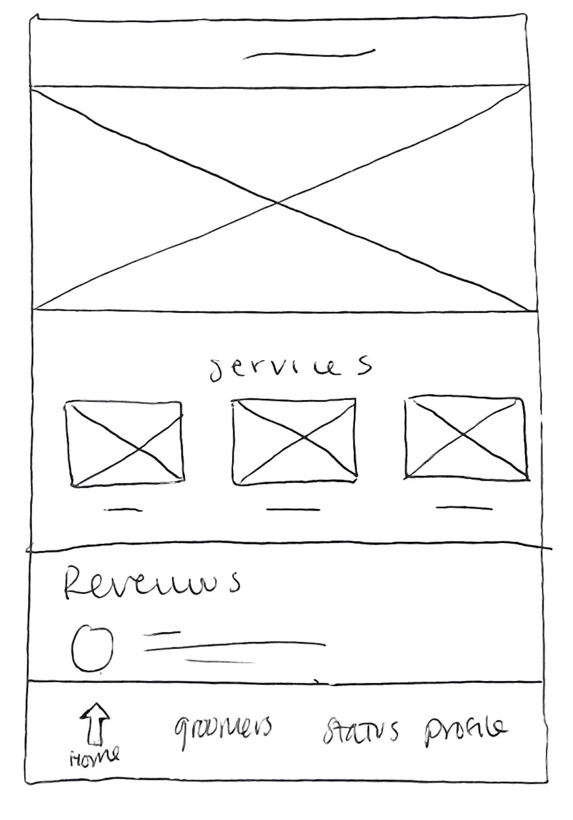
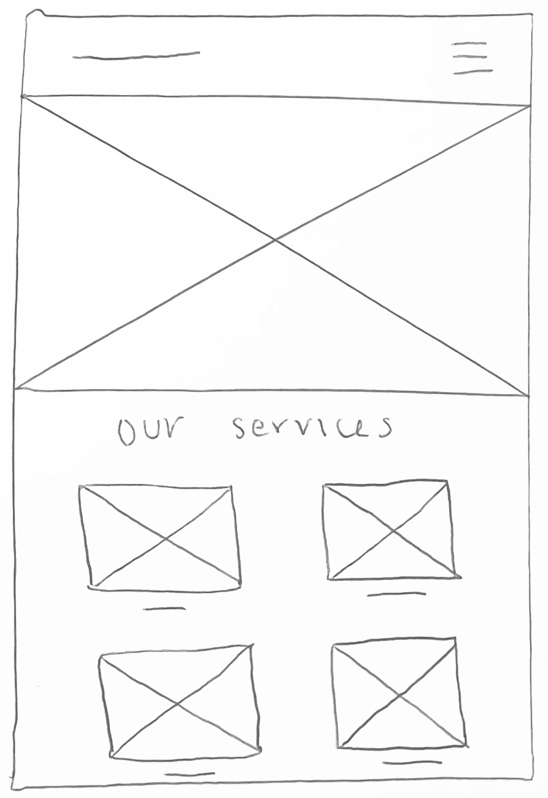
HOMEPAGE WIREFRAMES
LOW FIDELITY TESTING
Prototypes
After exploring different page layouts, I refined my wireframes into low-fidelity prototypes. Connecting the pages helped validate navigation, booking flows, and onboarding interactions before moving into high-fidelity UI design.
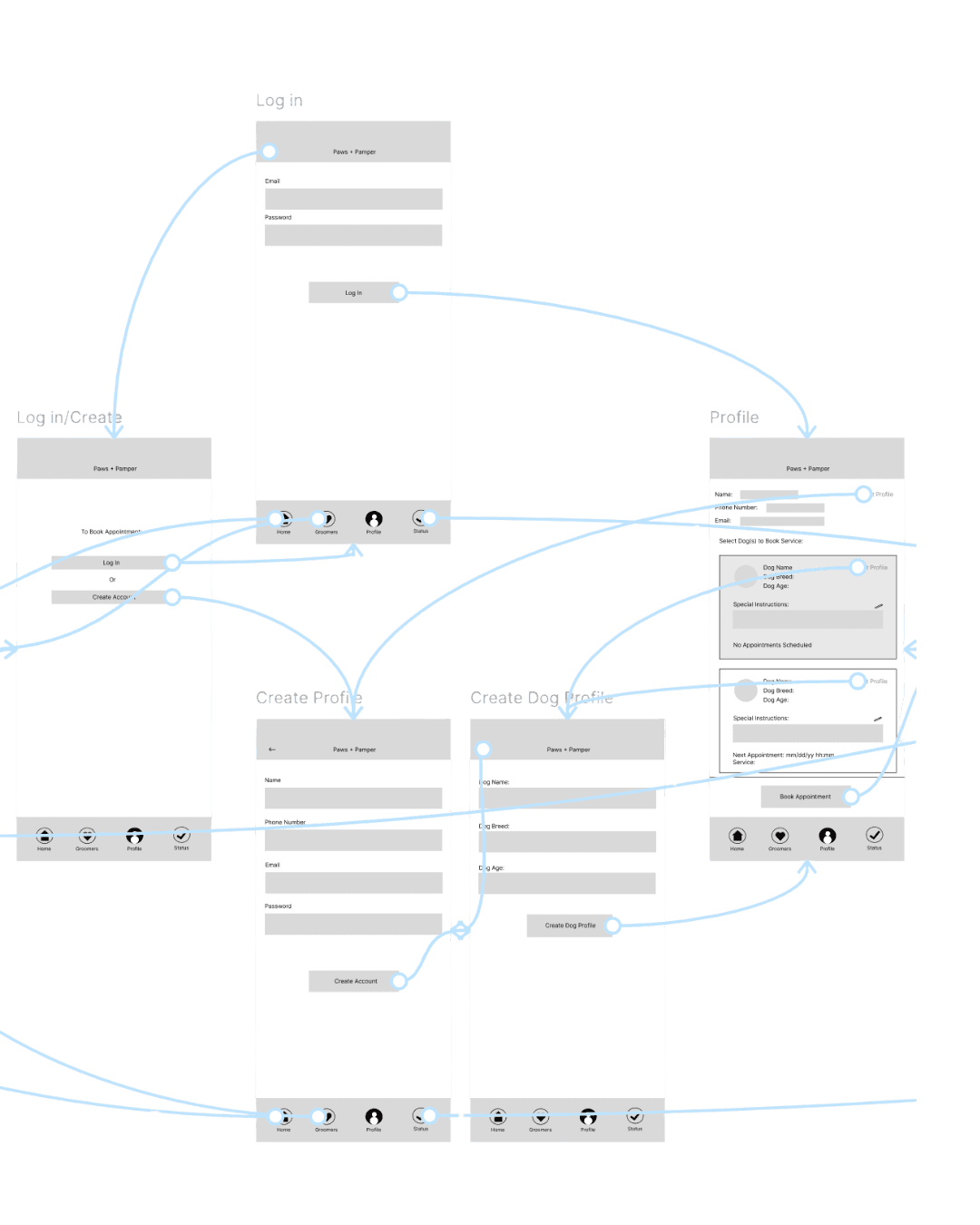
ONBOARDING FLOW
Tested new-user introduction, account setup, and pet profile creation.

BOOKING APPOINTMENT FLOW
Tested service selection, scheduling, and confirmation steps.
TESTING USABILITY
Design Evolution Through Iteration
After developing low-fidelity prototypes, I conducted a moderated usability test with a participant representative of the target user. They completed key booking tasks using a think-aloud protocol, supported by follow-up questions to understand expectations and decision-making. The results informed refinements to the high-fidelity prototypes, and ensured the final design aligned with user needs and confidence in booking.
POSITIVE SIGNALS
- The booking flow was straightforward.
- Scheduling for multiple dogs was perceived as valuable and intuitive.
IDENTIFIED FRICTION
- Appointment status was unclear after booking.
- The user sought reassurance their dog was “in good hands.”
- Service information and messaging were not easily discoverable.
DESIGN ADJUSTMENTS BASED ON INSIGHTS
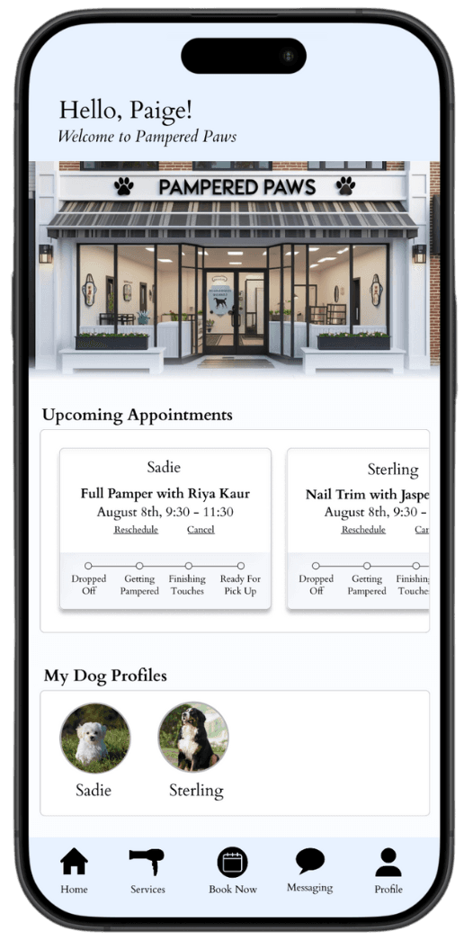
- Surfaced appointment status to reduce uncertainty and increase trust.
- Enhanced dog profile personalization on the home screen for emotional reassurance.
- Added service info and messaging to the primary navigation for new and returning users.
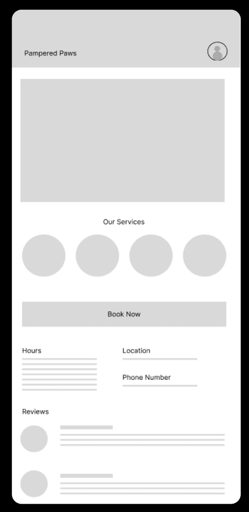
Wireframe
Testing structure & navigation
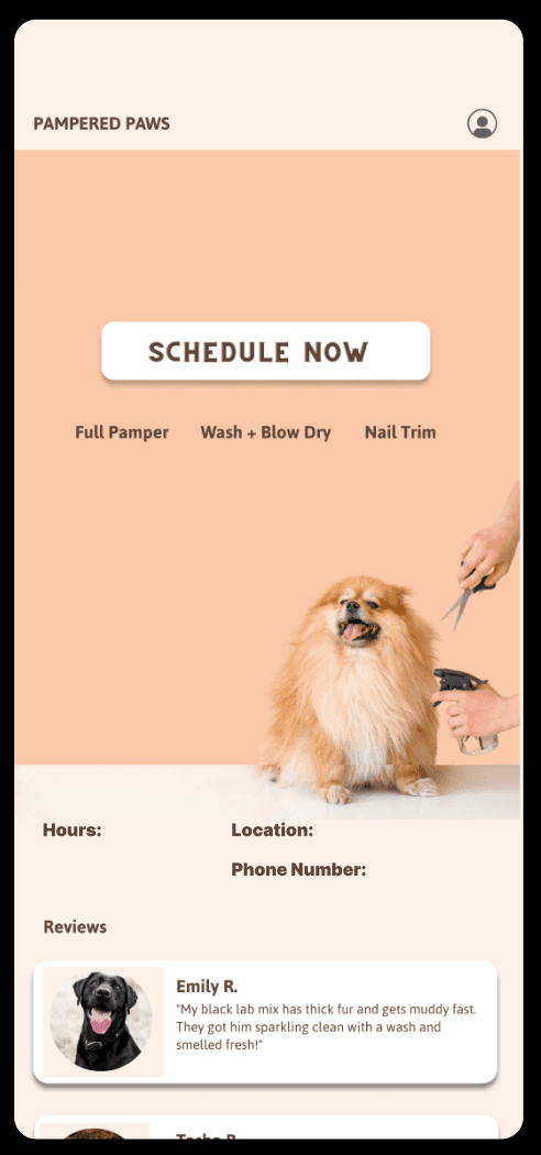
First Iteration
Added visual identity + clearer CTA
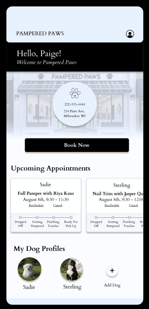
Second Iteration
Personalized homescreen with appointments + dog profile
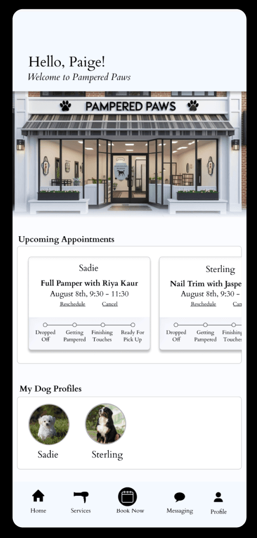
Final Design
Added navigation bar with CTA throughout entire app
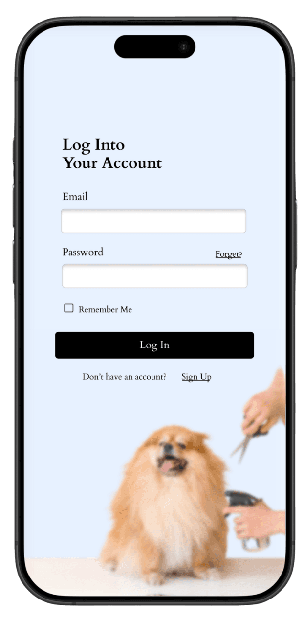
PROJECT OUTCOME
Final Design
Iterative testing refined the booking experience, strengthened multi-dog support, and increased trust through clearer groomer profiles, messaging, and appointment status updates. A key design challenge was balancing simplicity with reassurance, since early concepts felt either too bare or overly busy. The final outcome is a streamlined and confident scheduling experience that helps pet owners feel informed and supported throughout the process.